It’s one thing to know the analytical tools, when and how to apply them, but it can be quite another to use them! When it comes to turning data into graphs and charts not every CI practitioner is a whizz on Excel and certainly not everybody has access to powerful stats tools like MiniTab. Recognizing this, one rainy day we started developing some web-based tools aimed at making life easier for every day Lean Six Sigma / Continuous Improvement activities and providing some pick-up and easy to use tools to do the job.
It is said, “A good tool improves the way you work. A great tool improves the way you think”. And it is also said, “There is great satisfaction in building good tools for other people to use”.
Well, we are both pleased and satisfied to share these tools through our website, to support data analysis, calculation, and statistical process control.
The software is currently in Beta and so please do help us to improve it by providing your feedback on any suggestions or to report any niggles you experience!
Entering Data
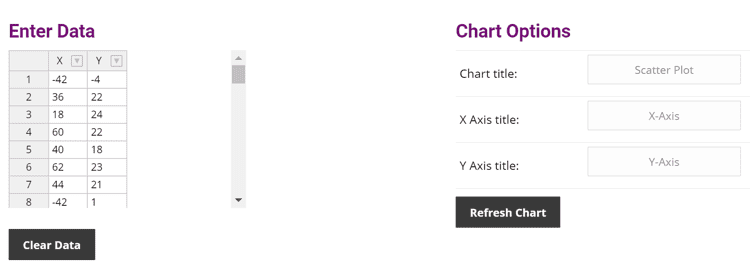
Each tool will initially load with some sample data to give you an idea of what it does. To enter your own data simply:
- Click “Clear Data” to clear out the table
- Copy and Paste your values
- Choose your chart options
- Click Refresh Chart and away you go!
Save, Share and Export
Each chart offers the possibility to create a link to your chart so you can save your work and continue where you left off and/or send the link to others so they can see your chart.
There is also the possibility to download your chart as a picture so you can embed it in presentations such as your project storyboard and/or other documents. Let us know how you get on!
Histogram
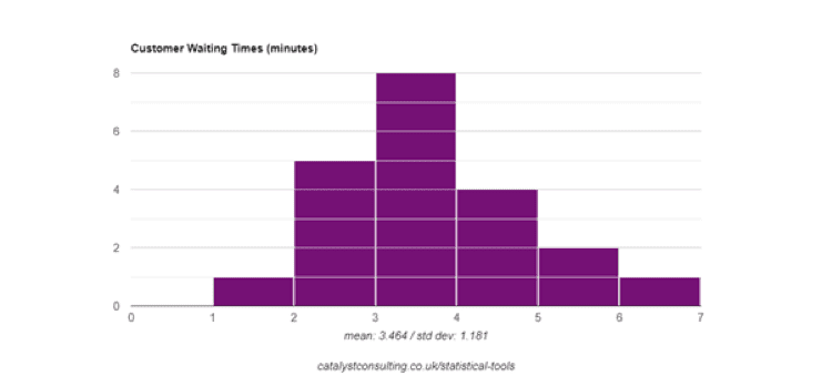
The bars show how many values in the dataset lie within specific ranges called bins. In the example below, we can see there were 5 instances when the waiting time was between 2 and 3 minutes.
Use this tool to visualise where the data is centred (around 3.5 in the example) and the spread of results (from 1 to 7 in the example) – is there a broad or small range?. Is the range (the amount of variation we can see in the results) too broad? Remember Dr Deming’s message, “Reduce Variation!” The histogram also lets us visualise the shape of the results and this too can be illuminating! Is the data normally distributed or skewed? Or is it bi-modal (a two-humped distribution)? Are there any extreme values (outliers)? Do we know why it looks like it does?
Scatterplot
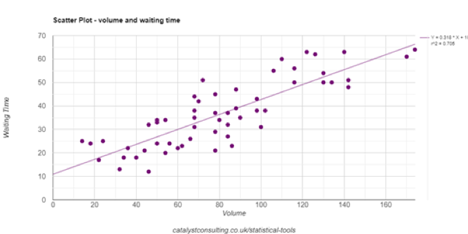
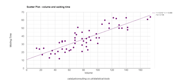
Scatterplots help us see relationships (correlations) between pairs of measures e.g. height and weight. Remember that correlation does not necessarily imply causation! For example, there’s a correlation between US per capita cheese consumption between 2000 and 2009 and the number of people who died by becoming tangled in their bedsheets. Understanding whether and how much a cause contributes to an effect may help us sleep easier, with or without the cheese. This example shows waiting times by volume. There is a positive correlation (the higher the volume, the greater the waiting time).
Pareto
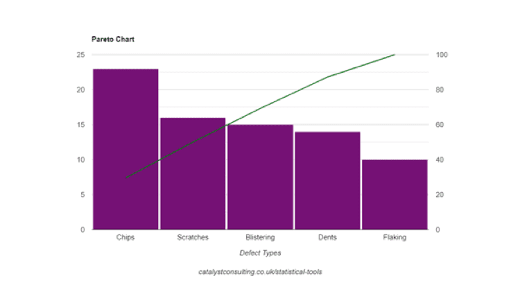
A Pareto chart is used to present categorised data with the bars arranged from most to least frequently occurring category, and a line showing the cumulative percentage. One or two categories that dominate the picture would signify a ‘Pareto Effect’, helping prioritisation by differentiating the vital few from the trivial many. Pareto was the Italian Economist who stated that 80% of the nation’s wealth was controlled by 20% of the people. This is also referred to as the 80/20 rule, and there are numerous examples in business and in ‘real life’. The Pareto Chart in the example below does not indicate 80/20 behaviour!
Dot Plot
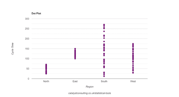
This tool is used to segment a data set into groups. When we suspect that cycle time differs by region, for example, we segment our data into the categories within the group (North, South etc). Look for differences between where the groups are centred and if they have similar ranges. If they are similar, is that what you expected? If there are differences, do you know why? If not, go and find out! This example shows clear differences in centring and spread – in the world of improvement, we have uncovered an opportunity. Ask why!
Box Plot
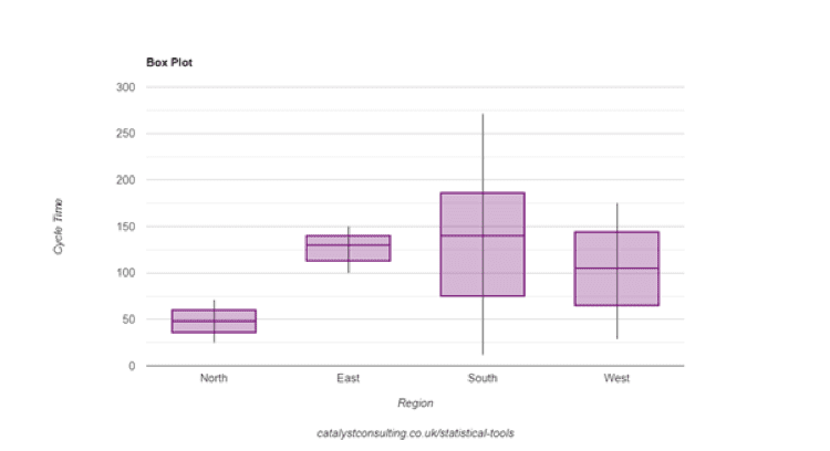
Box Plots are similar to Dot Plots in that they are used to compare different distributions, but they also visualise the data in quartile groups and show the median. They’re useful for larger data sets (at least 25 data points). This example shows the cycle time of a process by region. There are some clear differences to start to explore.
Sample Size Calculator
‘How much data do I need’? is a frequently asked question. It depends – but the calculator provided provides guidance by working out how much data is needed to achieve the required precision or work out how precise we will be with data we already have. Separate calculators are available for continuous data (obtained by measuring) and discrete data (obtained by counting).
Here’s an example of a process where we want to collect some data on process cycle times (continuous data). We know the standard deviation and require precision to the nearest minute. To be 95% confident that the mean of the sample is within plus or minus 1 minute of the mean of the process , we’d need to collect 36 data points. The more precise we want to be, the greater the size of sample we’d need to obtain. When using this tool remember to use units consistently. Here the standard deviation and precision values are in minutes. To be more precise – within plus or minus 30 seconds , say – the precision value would be 0.5.

Sigma Calculator
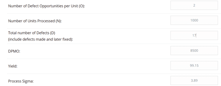
This tool works out the Sigma Value, Yield and DPMO (Defects Per Million Opportunities) of the process, using the DPMO method. Input information on the defect opportunities (number of CTQs) the number of defects observed in the sample, and the sample size and all will be revealed! Establishing how many defect opportunities is the most difficult aspect – we need to be clear on what aspects of the process are most important to the process customers.
This example is for a process with two defect opportunities – one relates to quality and one relates to time. There have been 17 defects in total.
Takt Time
Use this to work out how quickly to produce outputs in order to meet customer demand. Now compare this with process cycle time – if the takt time is less than the cycle time some improvement effort is required. The example provided here shows the Takt time where we work an 8 hour day and have 100 customer requests each day.

Run Chart
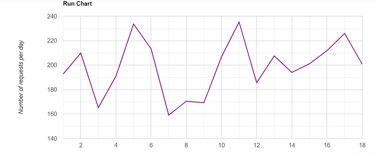
This simple tool will display a picture of performance over time, to support the identification of patterns or trends. For example, a KPI result can be tracked over time to highlight an upward, downward, mixed or stable course.
X/mR Chart
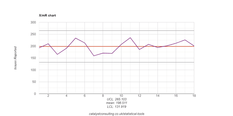
Also known as an I-MR Chart or Individuals Chart, this tool provides a picture of performance over time . The control limits are drawn at 3 standard deviations above and below the mean. The control limits are calculated from the data and are not to be confused with specification limits! We can use this chart to assess whether the process is behaving in a stable manner (common cause variation) or exhibiting signs of special cause variation such as outliers, shifts or trends.
Staged Control Chart
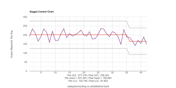
Use this version of the X/mR Chart when a process improvement is implemented to identify whether the mean and/or variability. This could be done on two separate control charts (before and after) but capturing them in one chart makes it easier for everyone to see the impact of the change.
These tools provide the potential to advance our understanding of performance, and support decision making and ultimately the delivery of impactful and sustainable change. Of course, there’s more to it than tools, but the right tools make our work easier, and using the right tools for the right purpose makes us more effective.
If you have any questions about the tools then please do contact us.
“If the only tool you have is a hammer, it’s hard to eat spaghetti”. – David Allen.

